Back
Smart onboarding for an international digital identity app
Designing a process with complex technology

FastID is an international start-up revolutionizing digital identification. Their innovative solution offers convenient and privacy-focused access to events, services, and locations through your phone, voice, or facial recognition. I took the lead in designing the initial app version, encompassing research, concept development, wireframing, and quality assurance. I worked in close collaboration with the client, their development team, and various designers.
In this case study, I delve deeper into my process and choices in designing the onboarding experience.
The product was still in a pilot phase, subject to many last-minute changes in features and the underlying technology.
The onboarding process contained many required steps, involving tasks such as scanning a passport or NFC chip.
Inconsistency in international identification documents brought various challenges in the onboarding process.
For the first version of the app, we had many requirements, including the ability for users to sign up and create a digital identity. When we started on this project, I indicated the onboarding process in the initial architecture as a small but essential part. However, this turned out to be one of the more complex flows. It required significant time and multiple iterations to create a user-friendly version.

Before starting on the flow, I discussed the requirements for the onboarding with the client. This included a few tasks that could become difficult for some of the users. There were also some relevant insights from the proto personas that we’ve used for the rest of the app that would apply here.


I researched apps with similar services to understand best practices and effective interactions. I expanded my search to study different onboarding flows, layouts, and relevant elements that could be incorporated into the project.
I sketched out flow concepts on paper, exploring different interactions and data collection methods. I also created a digital flow as a reference point for evaluation and future expansion.

I translated the flow into a wireframe, incorporating my research insights. This helped establish layout and interaction standards, which would be useful for future flows. With a strong focus on clear instructions for the user, i chose for a combination of text and animated illustrations.

During the wireframing, it became clear that the number of necessary steps and screens increased quite a bit. It was a tedious process that didn’t feel quite right just yet.
With an increased number of steps and screens, it was necessary to make some changes. Unfortunately, it wasn’t possible to decrease the number without losing required data. To mitigate user frustration when encountering complex tasks, we implemented various improvements to ensure a smoother experience.
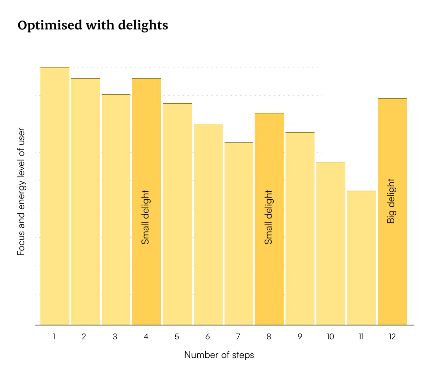
Throughout the process, we provided users with positive feedback on their progress. At key moments, a small message with a ‘thumbs up’ animation would appear. At the end of the process, we included a short, engaging video lasting four seconds to reignite enthusiasm for using the product.
The progress dots became an issue with the increased number of screens. We replaced them with an actual progress bar in the top of the screen. This cleared op some of the clutter and was more dynamic, making it easier to add or remove screens with no notable change.
To prevent users from quitting the process halfway, we allowed them to skip a few steps, such as the selfie validation. While this approach had its drawbacks, it significantly reduced the onboarding time. Users were given the opportunity to complete the skipped steps later.


We reached the stage where visual design became a bigger focus. Working closely with the UI designer in an iterative process, we standardized elements and refined interactions. This resulted in a polished version that was ready for review and testing.

During the testing of the development version, we encountered some challenges that required a solution. The main issue revolved around the scanning of the user’s ID.
ID’s such as passports turned out to be quite inconsistent between the countries that were issuing them. For example, the NFC chip could be on a different location than we instructed. It was also possible that it had no NFC chip at all.
While we initially designed our flow for passports only, it was now time to include other type of documents as well. The first being national ID’s, which were even more inconsistent than passports.
Another issue with scanning the NFC chip, were the different types of devices that users had. We noticed a big difference in sensitivity between Android and iPhone devices. The latter requiring a very specific position, or it would simply fail.

My goal was to guide every user through the easiest and most appropriate flow. To achieve this, we implemented additional steps in combination with device-specific information to ensure the correct flow for each user. While this might have lengthened the process for some users, it ultimately resulted in a shorter and more efficient experience for everyone involved.
At this point I’d removed the option to skip steps, as it was causing bigger issues in other areas of the app. On the bright side, this made it easier to manage the onboarding flow.
In certain scenarios, users had to follow an alternative flow that utilizes a different method for scanning their document. In our new setup, we were able to seamlessly guide the appropriate users directly into this alternative flow. In the event that the standard flow failed, the user would be automatically redirected to the alternative flow as a fallback solution.

Unknown to the user, we asked very specific questions combined with known data to guide them in the right direction, creating a smooth experience.
During a pilot program in the Czech Republic, we were able to collect valuable user feedback from real users. Participants were introduced to FastID and given the opportunity to test its functionality by using their digital ID for their hotel room check-ins.

Users often lacked understanding of what FastID was and its purpose.
Users underestimated the duration of the onboarding process, indicating a need for clearer communication.
Users found it unclear what the next steps were after successfully creating an digital identity.
The location and actions involved in the onboarding process didn't facilitate a smooth experience.
Cultural factors, such as concerns about surveillance, created skepticism around inputting personal data and facial recognition.

To manage expectations, we incorporated a separate pre-onboarding phase for new users, visually distinct from the main process. Balancing information and screen count presented challenges, resulting in a five-slide presentation featuring brief animations. We divided the process into three steps to give the users a rough idea of what to expect and prepare themselves.

To help users navigate easily, I included a short introduction that highlights the app's features. Since many users want to use FastID after signing up, which often involves scanning a QR code, we placed the QR scan button prominently in the middle of the screen for their convenience.


Ultimately, the onboarding process proved to be more complex than anticipated. After making additional adjustments to the text and animations, we arrived at a satisfactory conclusion for the time being, as there were other areas of the app that required attention and improvement.


For the first version of the app, we managed to create an onboarding process that will form a strong foundation for future expansions. It gathers all the necessary personal data to create a digital identity, while keeping it as simple as possible for the user.
Through smart questioning and available data, we successfully identified the type of document and device users possessed and directed them to the appropriate flow accordingly.
We optimized the onboarding process to approximately five minutes, enabling users to sign up and immediately utilize FastID at any location.
The onboarding experience effectively introduced users to FastID and familiarized them with the app's functionality.